Quick info guide
Thank you for purchasing our theme Patel Property WordPress Theme and Please contact us for any question. If you need support for our team will be a challenge to help you quickly.
Patel Property is a Mega Single Property Real Estate WordPress Theme for renting or selling your house, villa, apartment, farm house, land and raw houses.
It can be used for introducing about your house, apartment, villa, schedule visit, contact info or show gallery, write blog about house, etc
Our support team is looking forward to helping you!
We work Monday to Friday. Please remember this when you contact us. It’s faster for us provide support by our support system.
Support system: https://support.sk-web-solutions.com/
- Updated: October 08, 2019
- Version: 2.3
- Created by: SK Web Solutions
- Demo URL: https://patelproperty.sk-web-solutions.com/
- Support system: https://support.sk-web-solutions.com/
- Customization services: https://sk-web-solutions.com/services/
Table of Contents
- Installation
- Theme Options
- Pages
- Setting up Menu
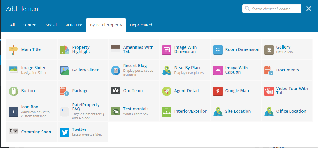
- Visual Composer Element
- Main Title
- Property Highlight
- Amenities With Tab
- Image With Dimension
- Room Dimension
- Gallery
- Image Slider
- Gallery Slider
- Recent Blog
- Near By Place
- Image With Caption
- Documents
- Button
- Package
- Our Team
- Agent Detail
- Google Map
- Video Tour With Tab
- Icon Box
- PatelProperty FAQ
- Testimonials
- Interior/Exterior
- Site Location
- Office Location
- Comming Soon
- Twiiter
- Room Dimensions
- Gallery
- Sidebars & Widgets
- Customisation
- Increase Page Speed
1. Installation
To Install this theme you must have a working version of WordPress already installed.
To Install this theme you must have a working version of WordPress already installed. For more information regarding installing the WordPress platform, please see the WordPress Codex.
Please note that we do not give support or any questions related on how to install and maintain wordpress. For any faulty installation that may cause your website or our theme malfunction you should refer to wordpress support system. Alternatively you can get help from your web hosting.
If you’ve downloaded whole theme package, unzip it. There you will find the theme installation file , user manual, dummy content .xml file etc.
Alternatively you can simply download the installable WordPress file.
When you are ready to install a theme, you must first upload the theme files and then activate the theme. For this purpose, unzip the file that you downloaded from themeforest and there you would find theme (patelproperty.zip) file and upload it via wordpress installer. The theme files can be uploaded in two ways
Install via FTP
Step by step: How to install patelproperty via FTP
- Step 1 – Log into your FTP client to access your host web server
- Step 2 – Browse to find the patelproperty.zip file on your computer (located in downloader folder from ThemeForest) and unzip it.
- Step 3 – Upload the folder you extracted from the zip file to yourdomain/wp-content/themes/ folder
- Step 4 – Activate the newly installed theme by going to WordPress > Appearance > Themes and clicking the Activate button.
- Step 5 – After you activate Patel Property you will see a notification message to activate the required plugins in the Plugins section of your dashboard. Patel Property Theme Functinality, Visual Composer, Revolution Slider, Contact Form 7 and Mailchimp plugin is required.
- Step 6 – Click on Install Button on each plugin to start installing them. After you’ve installed them, Activate them.
Install via WordPress
Step by step: How to install patelproperty via WordPress admin panel
- Step 1 – Navigate to Appearance > Themes
- Step 2 – Click Add New and click the Upload button.
- Step 3 – Browse to find the patelproperty.zip file on your computer and click Install Now
- Step 4 – Activate the newly installed theme by going to Appearance > Themes and clicking the Activate button.
- Step 5 – After you activate Patel Property you will see a notification message to activate the required plugins in the Plugins section of your dashboard. Patel Property Theme Functinality, Visual Composer, Revolution Slider, Contact Form 7 and Mailchimp plugin is required.
- Step 6 – Click on Install Button on each plugin to start installing them. After you’ve installed them, Activate them.
Plugin Installation
Patel Property includes 5 plugins that will need to be installed and activated: Patel Property Theme - Functionality, Visual Composer, Revolution Slider, Contact Form7 and Mailchimp. When you install Patel Property, you will get a notification message in your WordPress admin telling you of the required and recommended plugins.

Required plugins:
- Patel Property Theme - Functionality: This is our own plugin that is required to use Patel Property properly. Please make sure this is always installed and activated.
- Visual Composer: This is a premium page builder plugin created by WpBakery.
- Revolution Slider: This is a premium slider plugin created by ThemePunch.
- Contact Form 7: This plugin can manage multiple contact forms, plus you can customize the form and the mail contents flexibly with simple markup.
- Mailchimp: MailChimp provides marketing automation for e-commerce businesses. Send beautiful emails, connect your e-commerce store, advertise, and build your brand.

Plugin Installation & Update Notification
When you install Patel Property or update Patel Property, you will receive a WordPress notification message letting you know to install or update the required and recommended plugins. Please follow the on screen prompts to install, activate or update.
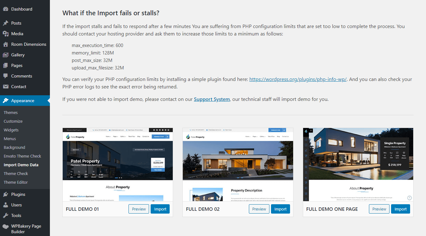
How to import demo content
Patel Property comes with the One Click Import feature so easily start with content in the right way. To install demo content proceed as follow.
- Navigate to Appearance > Import Demo Data
- Select the demo you want to install by clicking on Import
Edit your wp-config.php file and enter something like:
define('WP_MEMORY_LIMIT', '128M');
WordPress memory can be different to the server – you need to set this regardless of server memory settings If you have access to your PHP.ini file, change the line in PHP.ini If your line shows 32M try 64M:
memory_limit = 64M ; Maximum amount of memory a script may consume (64MB)
If you don’t have access to PHP.ini try adding this to an .htaccess file: php_value memory_limit 64M
If none of the above works then talk to your host.
How to update Patel Property
There are three ways to update theme
Best Practice
- Always check our update notes
- Always backup the files and the database, in case something goes wrong with the server you could use the backup to revert to the previous state. For more information on how to backup check the official documentation.
- Do not keep older copies of the theme inside wordpress themes folder
- Reset the cache after you update
1. Update theme via FTP
- Place your site in maintenance mode, for this you could use a plugin (ex. Ultimate Maintenance Mode, WP Maintenance Mode, … etc.)
- Go to “yoursite/wp-content/themes” folder location and backup your Patel Property theme folder by saving it to your computer, or you can choose to simply delete it. Your content will not be lost but note that if you have modifications on the theme code they will be lost. You have to reapply them after the update is over.
- Connect to your FTP account using Filezilla.
- Inside Filezilla navigate to the wordpress theme directory “yoursite/wp-content/themes”.
- Retrieve the patelproperty.zip file from your recently ThemeForest download and extract the file to get the updated singleproperty theme folder.
- Drag and drop the new Patel Property theme folder into “yoursite/wp-content/themes” and overwrite the existing files.
2. Update the theme automatically
- Download the envato wordpress toolkit from here: https://github.com/envato/envato-wordpress-toolkit
- Upload and activate the envato wordpress toolkit plugin (.zip file that you downloaded).
- Get your new api key
- Go to Envato Toolkit Menu and add your Themeforest Username and the API Key that you generated from your account in the required fields. Save your settings. If you have problems with the update check Skip Theme Backup checkbox.
- Update the theme.
- Choose Activate the theme.
3. Update the theme via WordPress
- Deactivate the current Patel Property theme from the Appearance > Themes section by activating a different theme. Once you activate a different theme, delete the Patel Property theme. Don’t worry, your content will not be lost.
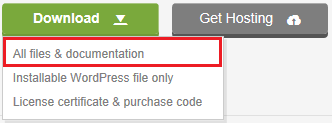
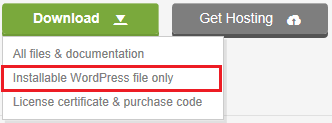
- Get the “patelproperty.zip” file from your new Themeforest download (Installable WordPress file only). If you downloaded the “All Files & Documentation” from Themeforest, then you need to unzip the archive file you received, the patelproperty.zip will be inside it.
- Go to Appearance > Themes, choose Add New Theme, Upload the patelproperty.zip” and click on the “Install Now” button.
- After your upload is finished choose Activate the theme.
2. Theme Options
The Theme options is probably one of the first things you will want to setup. There are many different elements to the header, footer, google map, custom code, blog and many ways to customize it. These elements include logos, fevicon, contact detail and more.
General Options
Patel Property allows you upload different Pre-Loader or Scroll Top icons. All of this is done via our Patel Property Theme Options. The following articles listed below will cover several different sections of the general option.
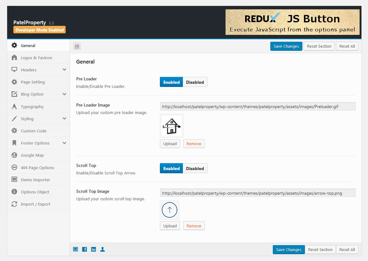
- Navigate to Theme Options > General Options
- Pre Loader : Enable/Disable Pre Loader.
- Pre Loader Image : Upload your custom pre loader image.
- Scroll Top : Enable/Disable Scroll Top Arrow.
- Scroll Top Image : Upload your custom scroll top image.
- Save Changes
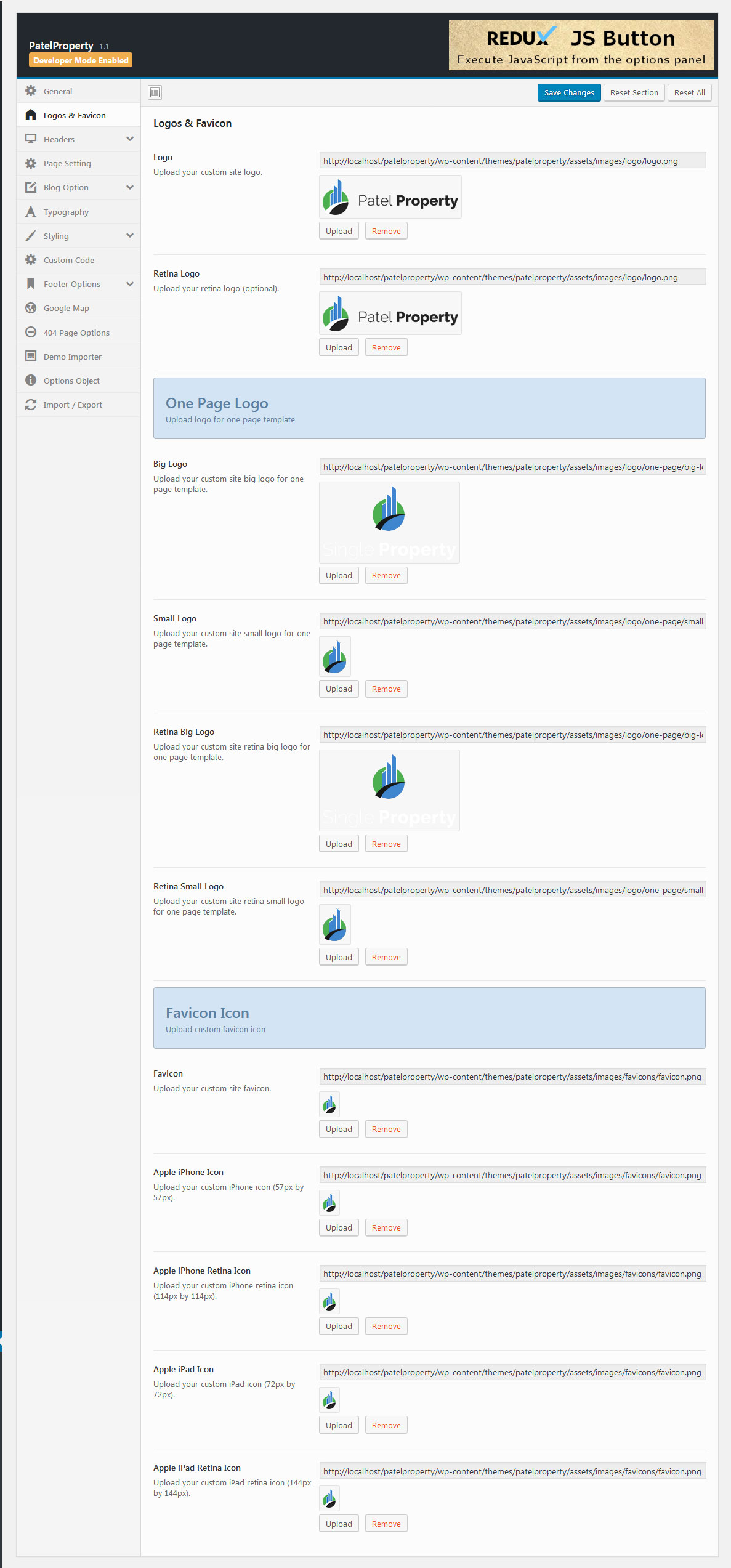
Logos and Favicon
Navigate to Theme Options > Logo & Favicon
Normal Page Logo- Logo: Upload your custom site logo.
- Retina Logo: Upload your retina logo (optional).
- Save Changes
- Big Logo: Upload your custom site big logo for one page template.
- Small Logo: Upload your custom site small logo for one page template.
- Retina Big Logo: Upload your custom site retina big logo for one page template.
- Retina Small Logo: Upload your custom site retina small logo for one page template.
- Save Changes
- Favicon: Upload your custom site favicon.
- Apple iPhone Icon : Upload your custom iPhone icon (57px by 57px).
- Apple iPhone Retina Icon : Upload your custom iPhone retina icon (114px by 114px).
- Apple iPad Icon : Upload your custom iPad icon (72px by 72px).
- Apple iPad Retina Icon : Upload your custom iPad retina icon (144px by 144px).
- Save Changes
Headers
This section contains options for header.
Top Header
- Navigate to Theme Options > Headers > Top Header
- Enable Top Header : Enable/Disable Top Header.
- Top Header Sidebar : Select the sidebar for top header.
- Save Changes
Menu
- Navigate to Theme Options > Headers > Menu
- Sticky Menu : Enable/Disable sticky menu.
- Menu Layout : Select the menu layout.
- Save Changes
- Navigate to Theme Options > Headers > Menu
- Enable/Disable Schedule Visit in header : Enable/Disable Schedule Visit
- Schedule Visit Label : Enther the Schedule Visit button label.
- Schedule Visit Model Shortcode : Paste your custom Schedule Visit model shortcode.
- Save Changes
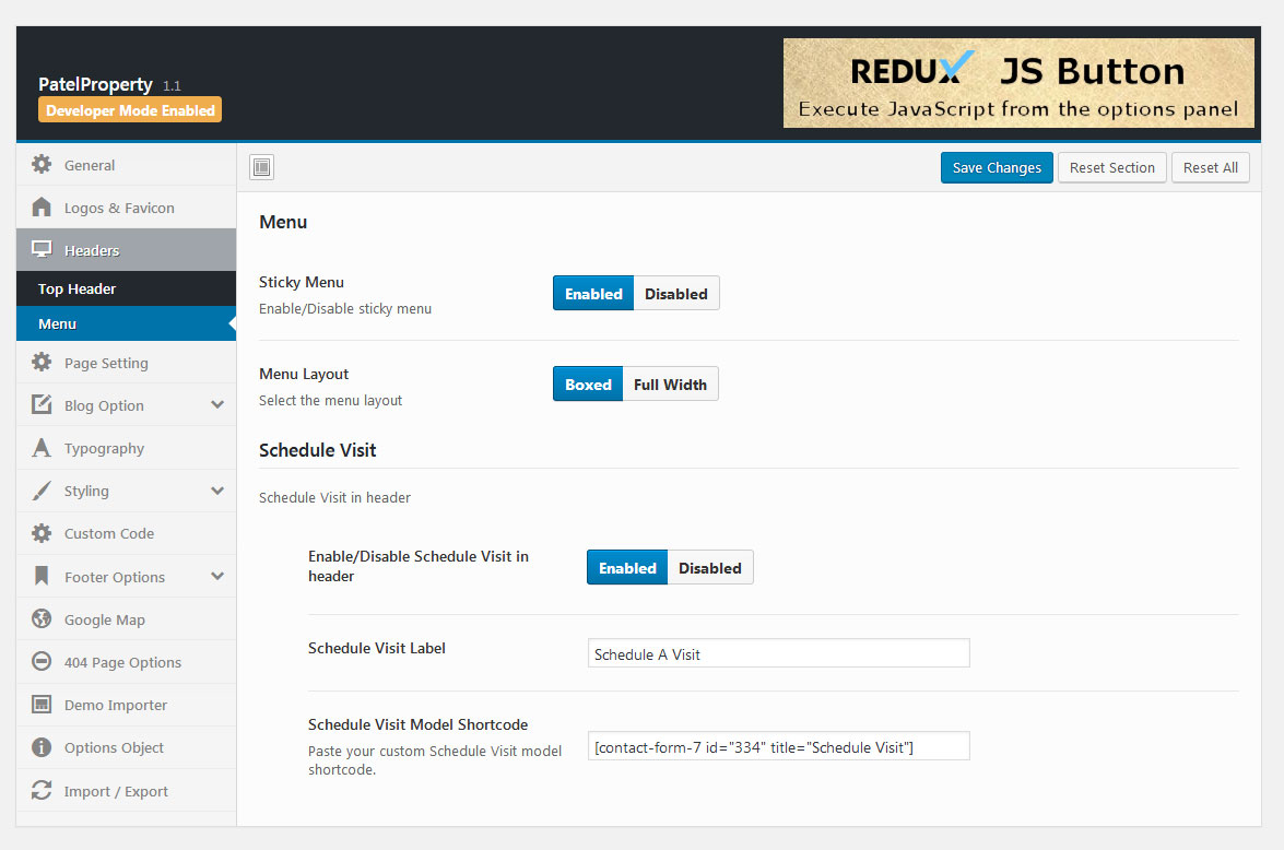
Page Setting
Customize Page banner/title/breadcrumbs.
- Navigate to Theme Options > Page Setting
- Show Title Area : Disabling this option will turn off page title area.
- Show Page Title : Enabling this option will show title on your page.
- Show Breadcrumbs : Enabling this option will show Breadcrumbs on your page.
- Archive Banner Image : Upload banner image for archive page.
- Search Banner Image : Upload banner image for search page.
- Save Changes
Blog Options
Customize Blog List And Detail.
Blog List/Archive Page Setting

- Navigate to Theme Options > Blog Options > Blog List/Archive
- Blog Style : Select the blog style. Choose between 1 or 2 or 3 blog style.
- Blog Layout : Choose the sidebar layout.
- Choose Widget Area in Sidebar : Choose Custom Widget area to display in Sidebar.
- Metadata Date : Enable/Disable Date of blog.
- Metadata Author : Enable/Disable Author of blog.
- Metadata Comment : Enable/Disable Comment of blog.
- Blog Excerpt : Enable/Disable Excerpt of blog.
- Blog Excerpt Word : Enther the number of words show in Blog Excerpt area.
- Read More Text : You can set another name instead of read more link.
- Save Changes
Blog Single Page Setting
- Navigate to Theme Options > Blog Options > Blog Single
- Banner Image : Upload custom Blog banner image.
- Blog Layout : Choose the sidebar layout.
- Choose Widget Area in Sidebar : Choose Custom Widget area to display in Sidebar.
- Feature Image : Enable/Disable Featured Image in blog single page.
- Metadata Date : Enable/Disable Date of blog.
- Metadata Author : Enable/Disable Author of blog.
- Metadata Comment : Enable/Disable Comment of blog.
- Tags : Enable/Disable Tags in blog single page.
- Tags Text : You can set another name instead of Tags text.
- Social Media Share : Enable/Disable Social Media Share in blog single page.
- Share Text : You can set another name instead of Share text.
- Facebook Share : Enable/Disable Facebook Share in blog single page.
- Twitter Share : Enable/Disable Twitter Share in blog single page.
- Pinterest Share : Enable/Disable Pinterest Share in blog single page.
- Linkedin Share : Enable/Disable Linkedin Share in blog single page.
- Google+ Share : Enable/Disable Google+ Share in blog single page.
- Tags : Enable/Disable Tags in blog single page.
- Tags Text : You can set another name instead of Tags text.
- Previous/Next Post : Enable/Disable Previous/Next Post indicator in blog single page.
- Related Post : Enable/Disable Related Post in blog single page.
- Related From Blog Text : You can set another name instead of Related From Blog text.
- Number Of Post : Enther the number of related posts to show in blog single post.
- Metadata Date : Enable/Disable Date of Related Post.
- Metadata Author : Enable/Disable Author of Related Post.
- Blog Excerpt : Enable/Disable Excerpt of Related Post.
- Blog Excerpt Word : Enther the number of words show in Related Blog Excerpt area.
- Read More Text : You can set another name instead of Related Post read more link.
- Save Changes
Typography
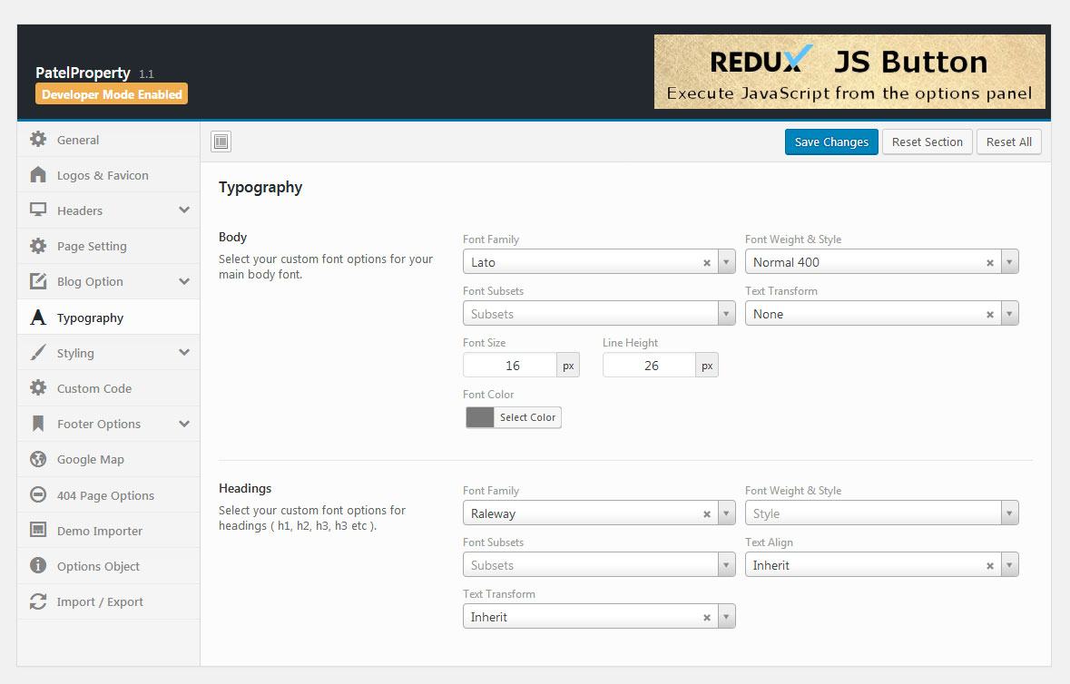
- Navigate to Theme Options > Typography
- Body : Select your custom font options for your main body font.
- Headings : Select your custom font options for headings ( h1, h2, h3, h3 etc ).
- Save Changes
Styling
Font Color
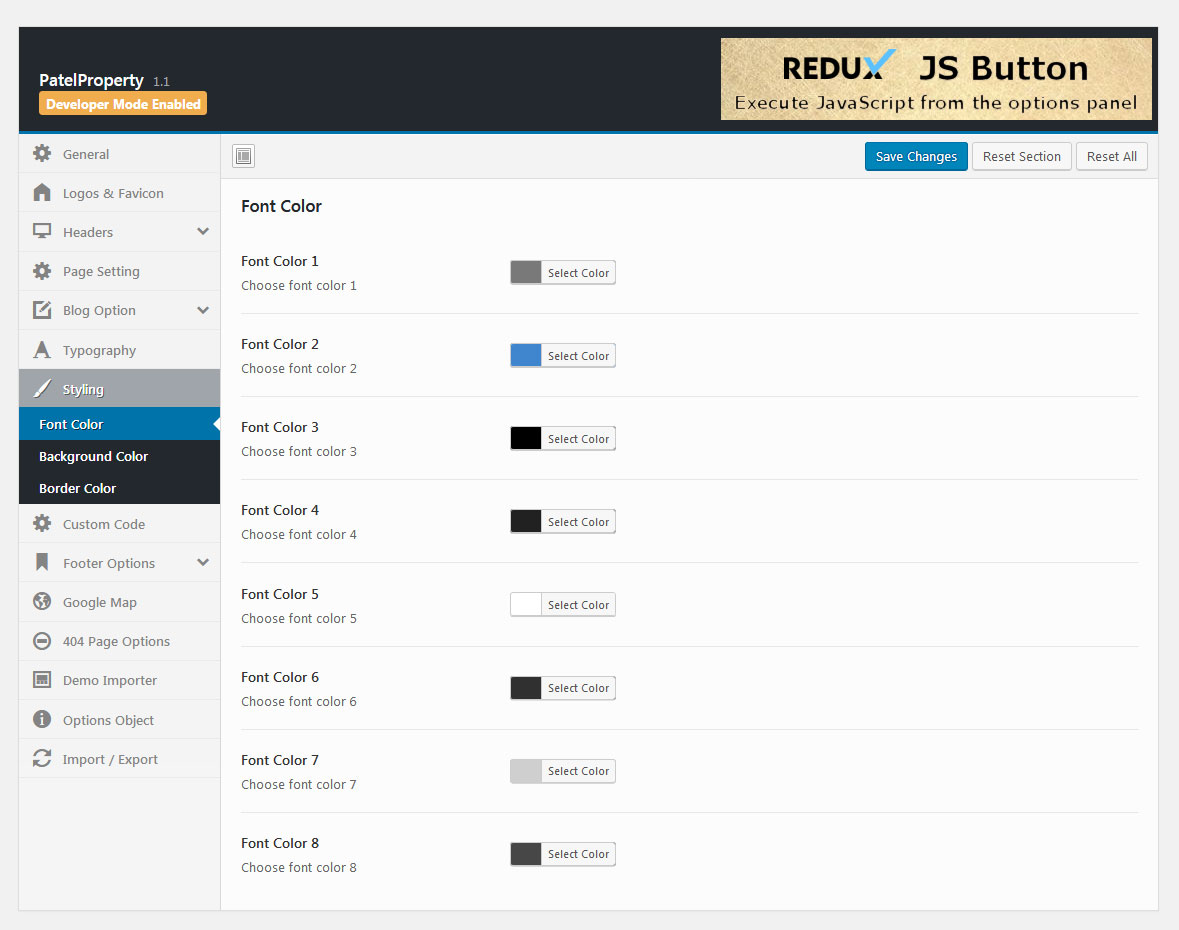
- Navigate to Theme Options > Styling > Font Color
- Font Color 1 : Choose font color 1.
- Font Color 2 : Choose font color 2.
- Font Color 3 : Choose font color 3.
- Font Color 4 : Choose font color 4.
- Font Color 5 : Choose font color 5.
- Font Color 6 : Choose font color 6.
- Font Color 7 : Choose font color 7.
- Font Color 8 : Choose font color 8.
- Save Changes
Background Color
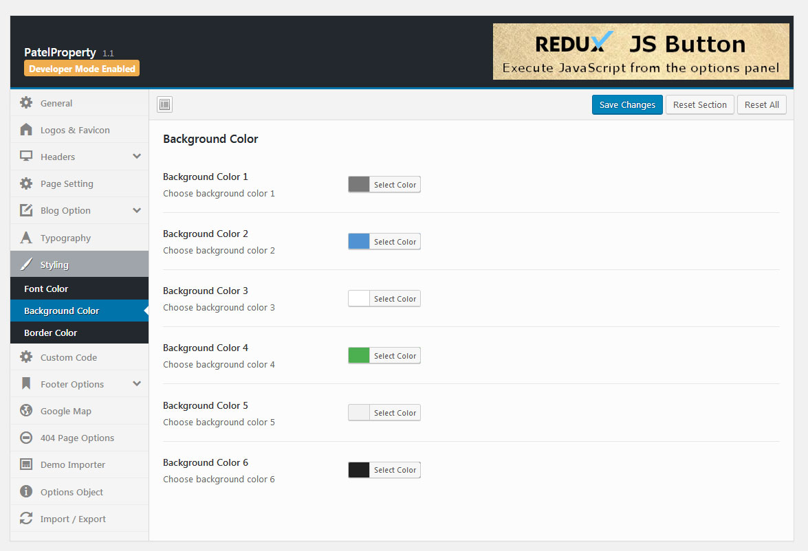
- Navigate to Theme Options > Styling > Background Color
- Background Color 1 : Choose background color 1.
- Background Color 2 : Choose background color 2.
- Background Color 3 : Choose background color 3.
- Background Color 4 : Choose background color 4.
- Background Color 5 : Choose background color 5.
- Background Color 6 : Choose background color 6.
- Save Changes
Border Color
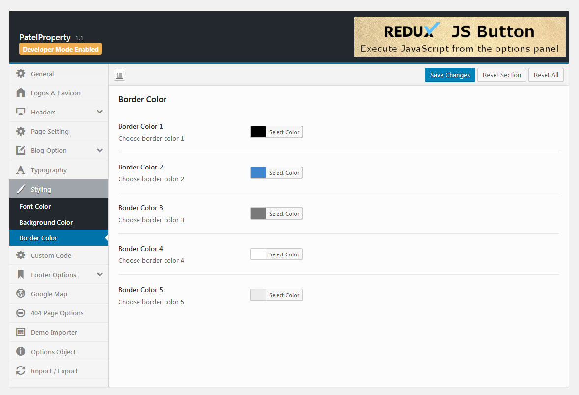
- Navigate to Theme Options > Styling > Border Color
- Border Color 1 : Choose border color 1.
- Border Color 2 : Choose border color 2.
- Border Color 3 : Choose border color 3.
- Border Color 4 : Choose border color 4.
- Border Color 5 : Choose border color 5.
- Save Changes
Custom Code
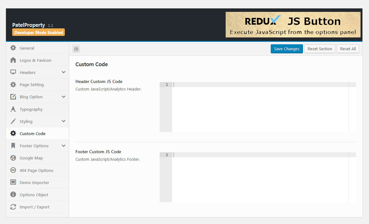
- Navigate to Theme Options > Custom Code
- Header Custom JS Code : Custom JavaScript/Analytics Header.
- Footer Custom JS Code : Custom JavaScript/Analytics Footer.
- Save Changes
Footer Options
Customize Footer section
Footer Block Before
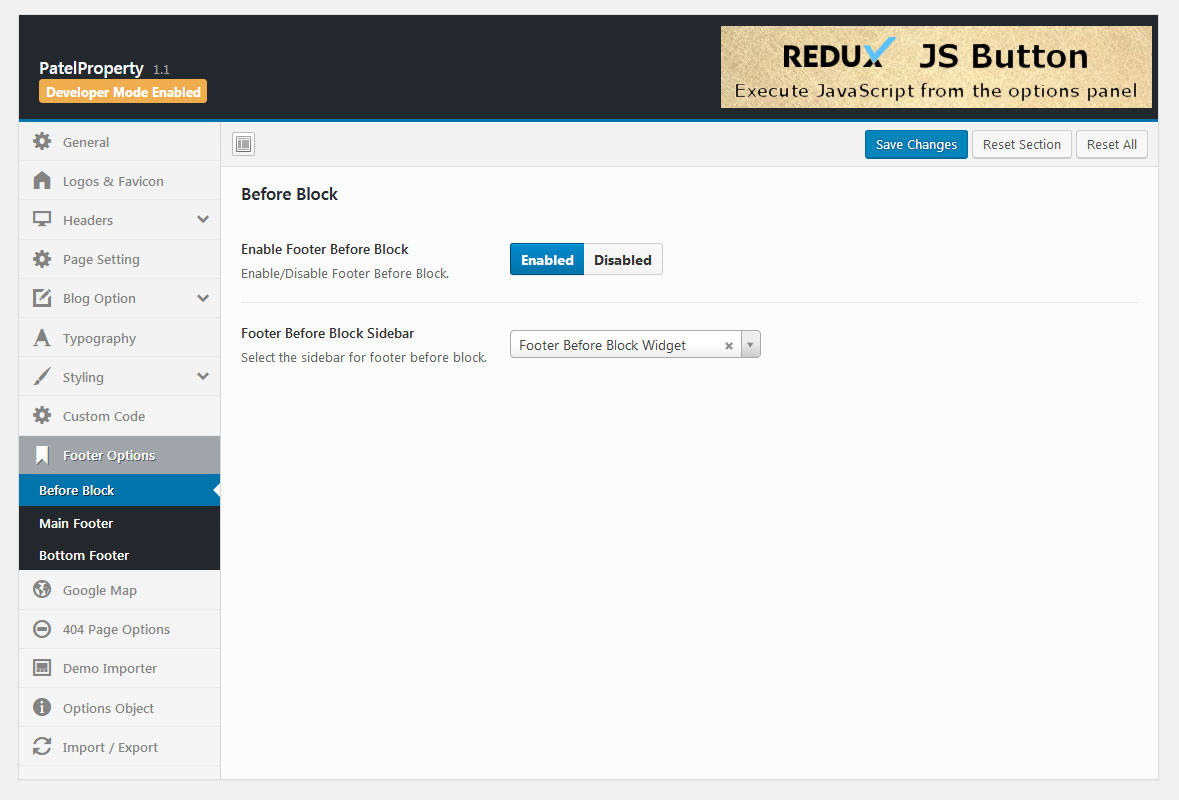
- Navigate to Theme Options > Footer Options > Before Block
- Enable Footer Block Before : Enable/Disable Footer Block Before.
- Footer Before Block Sidebar : Select the sidebar for footer before block.
- Save Changes
Main Footer
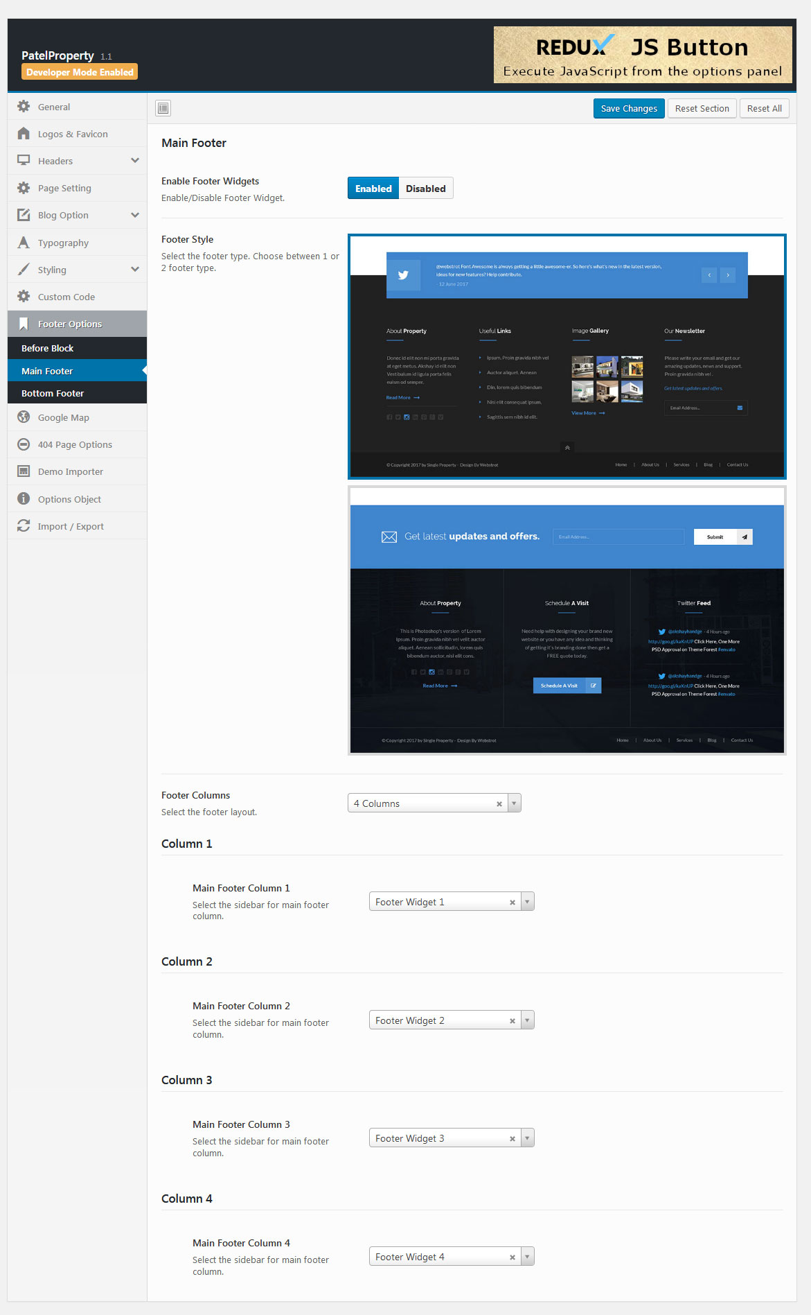
- Navigate to Theme Options > Footer Options > Main Footer
- Enable Footer Widgets : Select the footer type. Choose between 1 or 2 footer type.
- Footer Style : Select the sidebar for footer before block.
- Footer Columns : Select the footer layout.
- Main Footer Column 1 : Select the sidebar for main footer column.
- Main Footer Column 2 : Select the sidebar for main footer column.
- Main Footer Column 3 : Select the sidebar for main footer column.
- Main Footer Column 4 : Select the sidebar for main footer column.
- Save Changes
Bottom Footer
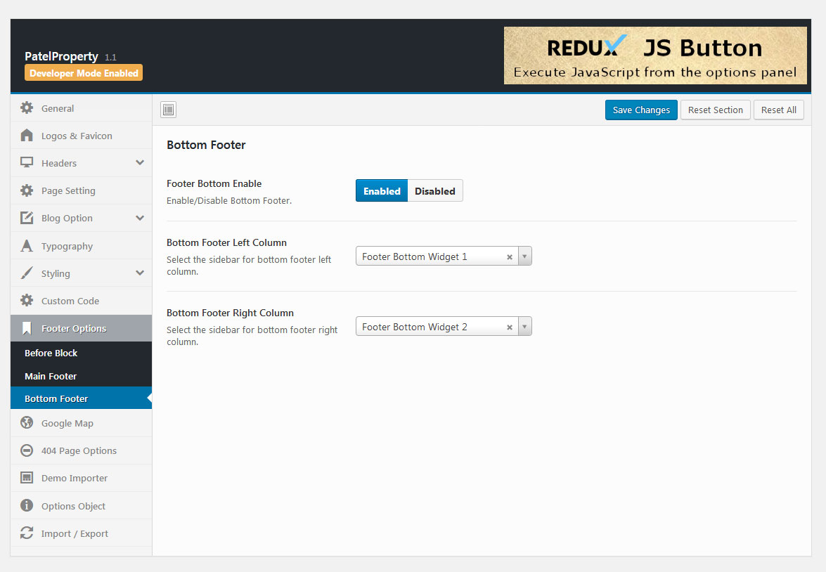
- Navigate to Theme Options > Footer Options > Bottom Footer
- Footer Bottom Enable : Enable/Disable Bottom Footer.
- Bottom Footer Left Column : Select the sidebar for bottom footer left column.
- Bottom Footer Right Column : Select the sidebar for bottom footer right column.
- Save Changes
Google Map
Google Map settings
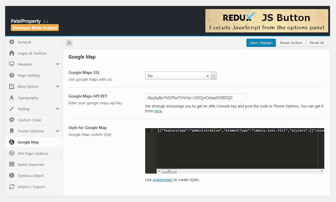
- Navigate to Theme Options > Google Map
- Google Maps SSL : Use google maps with ssl.
- Google Maps API KEY : We strongly encourage you to get an APIs Console key and post the code in Theme Options.
- Style for Google Map : Google Map custom style.
- Save Changes
404 Page Option
Customize 404 page

- Navigate to Theme Options > 404 Page Option
- 404 Banner Image : Upload banner image for 404 page.
- 404 Background Image : Upload banner image for 404 page.
- 404 Image : Upload image for 404 page.
- Page Title : Enther the Title of 404 page.
- Sub Title : Enther the Sub Title of 404 page.
- Page Content : Enther the Content of 404 page.
- Save Changes
3. Pages
Pages are the backbone of your website, and most likely you will setup several of them. There are different page templates to choose from, each serving a purpose to help you build a finished site.
Create a New Page
You can create any number of pages with content. Patel Property includes several page templates to choose from, and you will need to choose the page template that suits your needs. All of this is done in the pages section of your WordPress admin.
How to create a new page
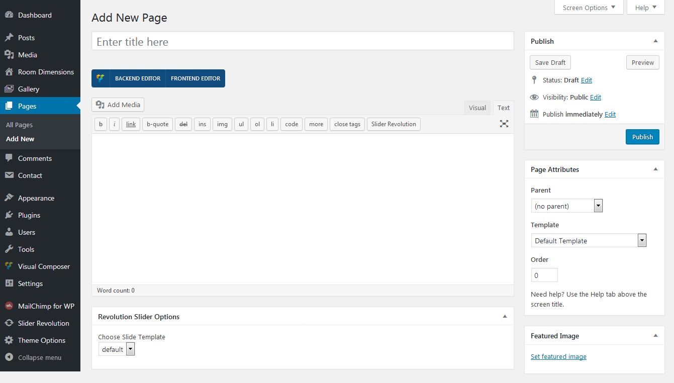
- Navigate to Pages in your admin sidebar and click Add New option.
- Input a new name for your page, then find the Page Attributes box on right side.
- Page Attributes:
- Set your Parent page. It’s usually set to No Parent.
- Set your page template from the Template dropdown list.
- Publish page
Create The Homepage
By default, WordPress shows your most recent posts in reverse chronological order on the front page of your site. Many WordPress users want a static front page as the front page instead. This "static front page" look is common for users desiring static or welcoming information on the front page of the site.
The look and feel of the front page of the site is based upon the choices of the user combined with the features and options of Patel Property theme.
How to create the homepage
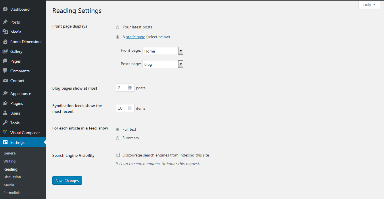
There are two steps critical to creating a static front page on your site with Patel Property.
- Follow the steps above in the Create a New Page section to create a static page to use as Homepage
- Once you create the static page navigate to Settings > Reading in your admin sidebar
- Front page displays : select a static page
- Front page : select the page you previously created
- Post page : select a page you want to use as blog
- Save Changes
4. Setting up Menu
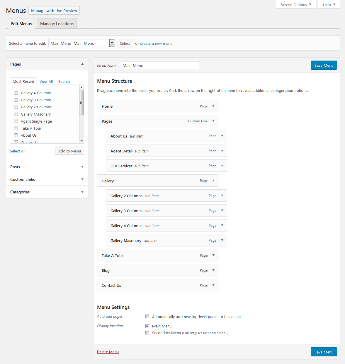
Create a New Menu
Blogstar supports custom WordPress menus, with up to five levels of dropdown support for the main menu. There are one areas of the theme where you can assign a menu: Main Menu
Please note that it is better to create your own pages first, even if they are blank pages
- Navigate to Apperance > Menus page
- Click the "create a new menu" link to make a new menu. Enter the name then hit Create Menu
- To add a menu item, you can easily select one of your already made pages on the left hand side and click Add to Menu
- Enter Navigation Label and Title Attribute.
- You can also add menu items by entering a custom name and custom link into the Custom Links box
- You can manage your menus using the drag and drop functionality. To create a dropdown menu, simply drag a menu item below and slightly to the right of another menu item and it will lock into place and create a dropdown section
- After setting up your menu, select the menu you just created as the Main Navigation in the Theme Locations box
- Once it's all done, make sure you click the Save Menu button
Create a One Page Menu
There are one areas of the theme where you can assign a menu: One Page Menu
- Navigate to Apperance > Menus page
- Click the "create a new menu" link to make a new menu. Enter the name then hit Create Menu
- To add a menu item from "Custom Links"
- Enther custom name and custom link into the Custom Links box
- After setting up your menu, select the menu you just created as the Main Navigation in the Theme Locations box
- Once it's all done, make sure you click the Save Menu button

5. Visual Composer Element
Main Title

- Heading : Select the title size like h1 to h6.
- First Title : Enther the frist title of main title.
- Second Title : Enther the second title of main title.
- Text Color : Select the custom title color.
- Save Changes
Output

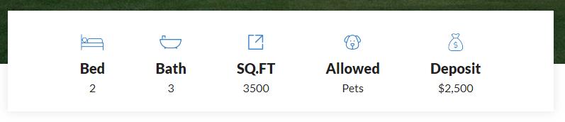
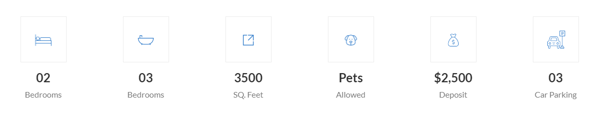
Property Highlight

- Style : You can choose among these pre-designed style.
- Property Highlight :
Enter Property Highlight - icon, name and value.- Icon to display : Use an existing font icon or upload a custom image.
- Icon library : Select icon library.
- Icon : Select icon from library.
- Title : Provide the title for this property highlight.
- Value : Provide the value for this property highlight.
- Class : Enther the custom class name.
- Save Changes
Output
Style 01
Style 02
Amenities With Tab
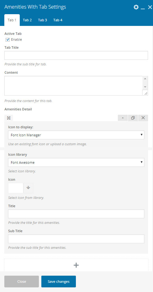
- Active Tab : Enable/Disable tab.
- Tab Title : Provide the sub title for tab.
- Content : Provide the content for this tab.
- Amenities Detail :
- Icon to display : Use an existing font icon or upload a custom image.
- Icon library : Select icon library.
- Icon : Select icon from library.
- Title : Provide the title for this amenities.
- Sub Title : Provide the sub title for this amenities.
- Save Changes
Output

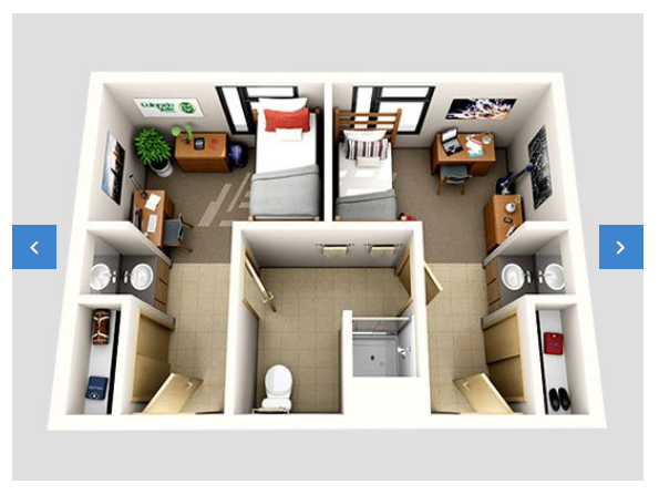
Image With Dimension
- Images : Upload your custom images.
- Dimension : Enter the dimension.
- Save Changes
- Arrow Navigation : Show arrow navigation.
- Dots Navigation : Show dots navigation.
- Autoplay : Set slider autoplay.
- Speed : Enther slider speed.
- Autotime : Enther slider autotime.
- Save Changes
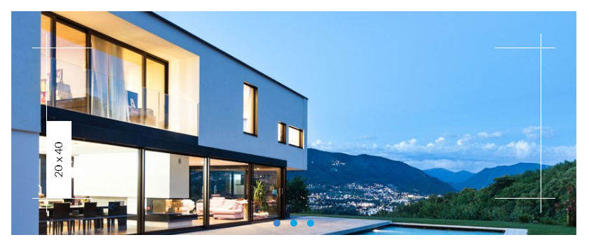
Output
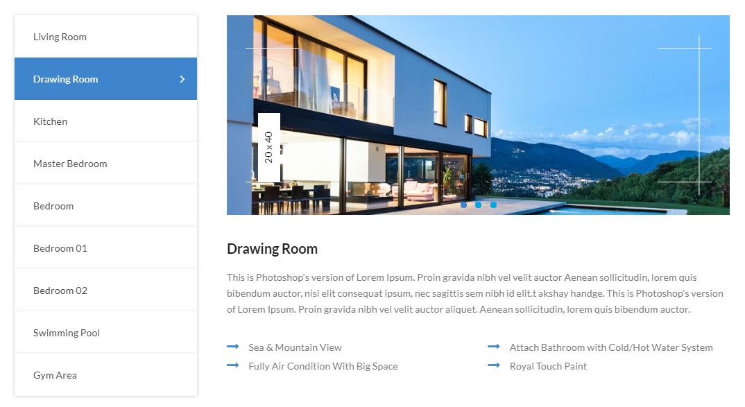
Dimension With Single Image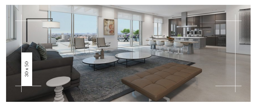
Room Dimension
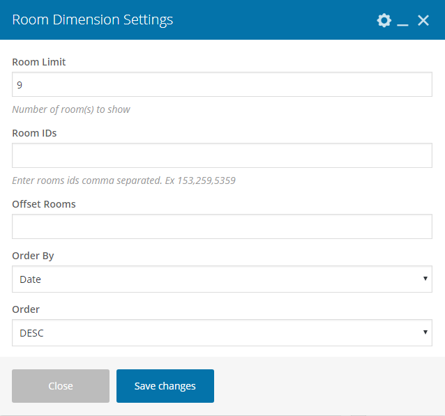
- Room Limit : Number of room(s) to show.
- Room IDs : Enter rooms ids comma separated. Ex 153,259,5359
- Offset Rooms : Set the offset of room.
- Order By : Select how to sort retrieved menu. Default by Date
- Order : Designates the ascending or descending order. Default by DESC.
- Save Changes
Output
Gallery
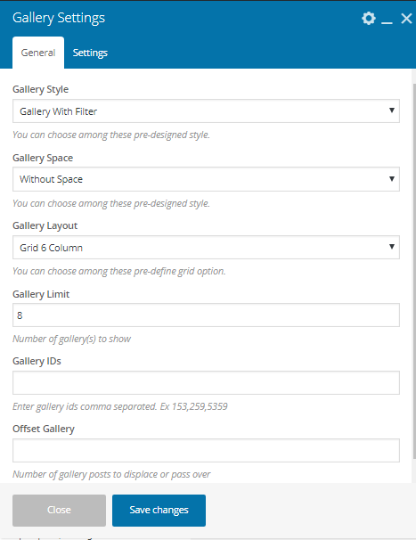
- Gallery Style : You can choose among these pre-designed style.
- Gallery Space : You can choose among these pre-designed style.
- Gallery Layout : You can choose among these pre-define grid option.
- Gallery Limit : Number of gallery(s) to show.
- Gallery IDs : Enter gallery ids comma separated. Ex 153,259,5359
- Offset Gallery : Number of gallery posts to displace or pass over.
- Save Changes
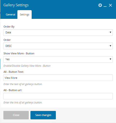
- Order By : Select how to sort retrieved menu. Default by Date
- Order : Designates the ascending or descending order. Default by DESC.
- Show View More - Button : Enable/Disable Gallery View More - Button
- All - Button Text : Enter the text of all gallerys button.
- All - Button url : Enter the link of all gallerys button.
- Save Changes
Output
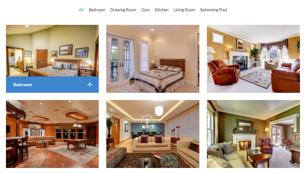
Image Slider

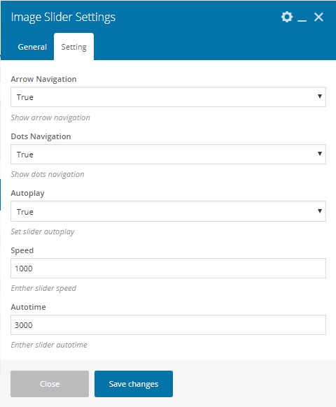
- Images : Upload your custom images.
- Slider Layout : You can choose among these pre-define column option.
- Save Changes
- Arrow Navigation : Show arrow navigation.
- Dots Navigation : Show dots navigation.
- Autoplay : Set slider autoplay.
- Speed : Enther slider speed.
- Autotime : Enther slider autotime.
- Save Changes
Output
Gallery Slider
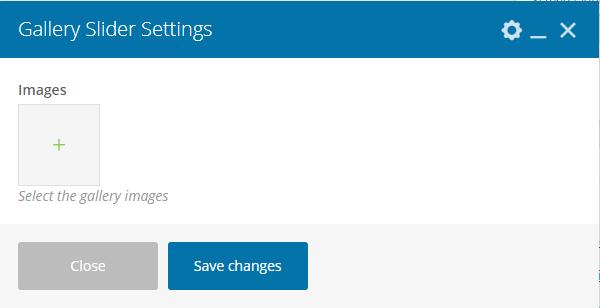
- Images : Select the gallery images.
- Save Changes
Output
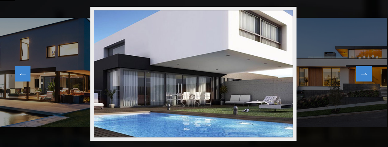
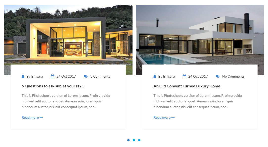
Recent Blog
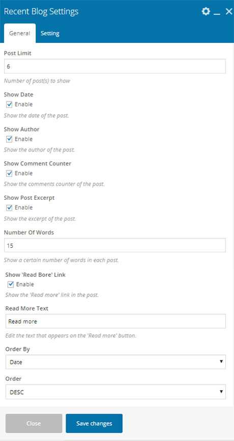
- Post Limit : Number of post(s) to show.
- Show Date : Show the date of the post.
- Show Author : Show the author of the post.
- Show Comment Counter : Show the comments counter of the post.
- Show Post Excerpt : Show the excerpt of the post.
- Number Of Words : Show a certain number of words in each post.
- Show 'Read Bore' Link : Show the 'Read more' link in the post.
- Read More Text : Edit the text that appears on the 'Read more' button.
- Order By : Select how to sort retrieved post.
- Order : Designates the ascending or descending order.
- Save Changes
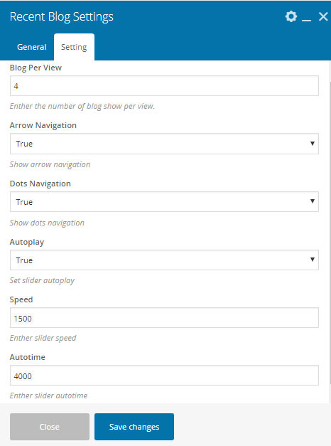
- Blog Per View : Enther the number of blog show per view.
- Arrow Navigation : Show arrow navigation.
- Dots Navigation : Show dots navigation.
- Autoplay : Set slider autoplay.
- Speed : Enther slider speed.
- Autotime : Enther slider autotime.
- Save Changes
Output
Near By Place
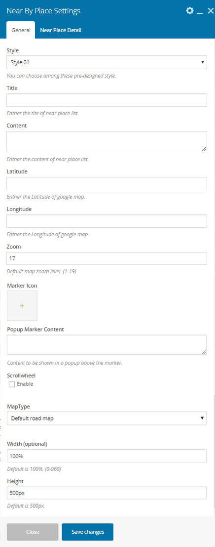

- Style : You can choose among these pre-designed style.
- Title : Enther the tite of near place list.
- Content : Enther the content of near place list.
- Latitude : Enther the Latitude of google map.
- Longitude : Enther the Longitude of google map.
- Zoom : Default map zoom level. (1-19)
- Marker Icon : Select cusrom marker icon.
- Popup Marker Content : Content to be shown in a popup above the marker.
- Scrollwheel : Enable/Disable Scrollwheel.
- MapType : Select map type.
- Width (optional) : Default is 100%. (0-960)
- Height : Default is 500px.
- Place Latitude : Enther the Latitude of google map.
- Place Longitude : Enther the Longitude of google map.
- Place Category : Enther the place category like ATM, Bank etc.
- Place Name : Enther the name or title of place.
- Place Distance : Enter the distance of place from home like 1.5 KM, 5.9 Miles etc.
- Popup Marker Content : Content to be shown in a popup above the marker.
- Place Image/Icon : Select the icon or image for place.
- Save Changes
Output
Style 01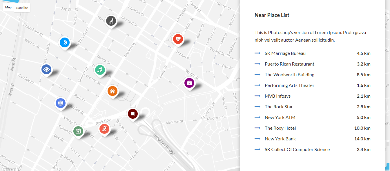
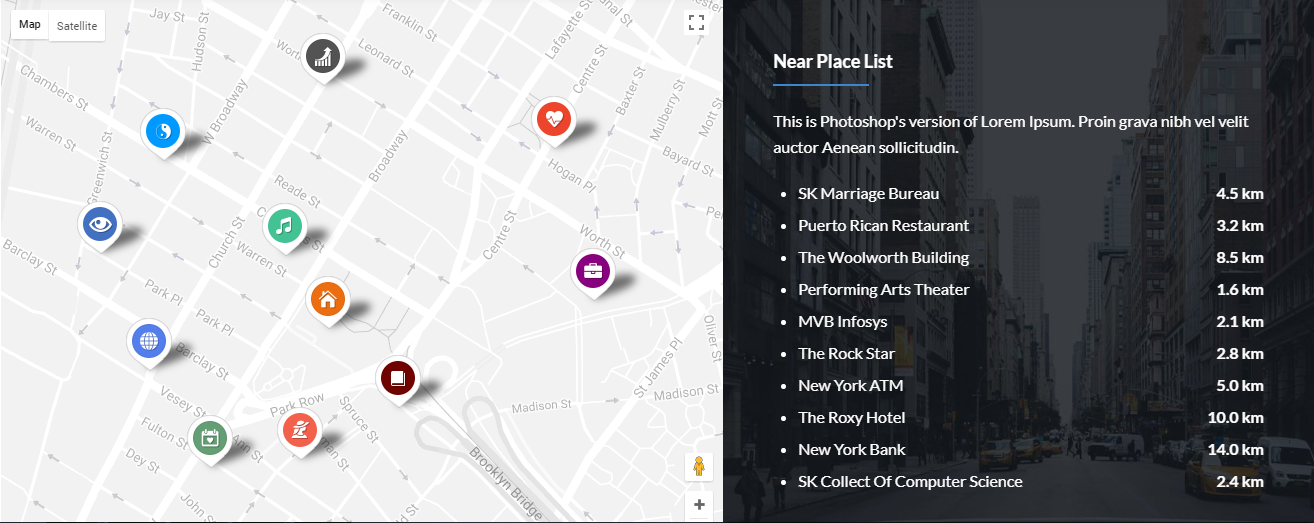
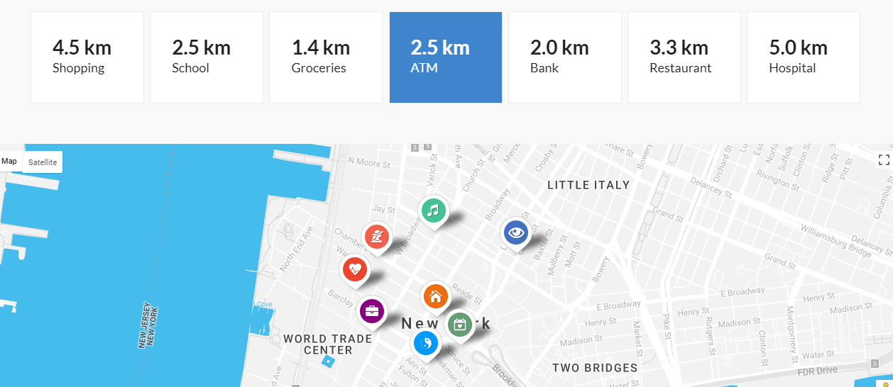
Image With Caption
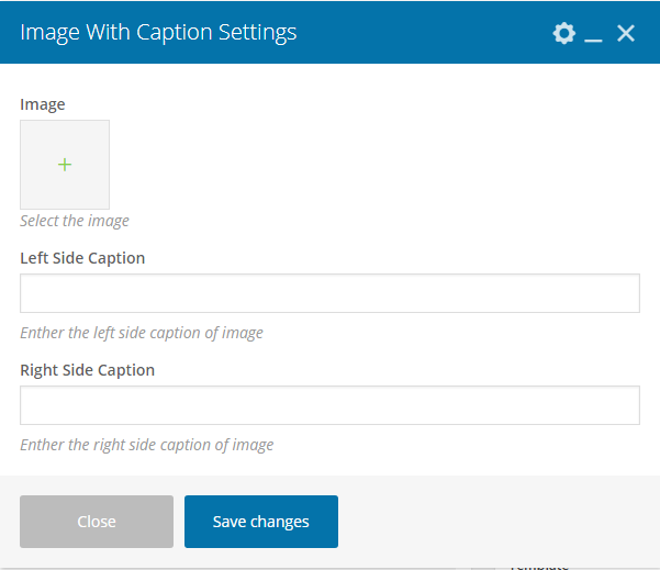
- Image : Select the image.
- Left Side Caption : Enther the left side caption of image.
- Right Side Caption : Enther the right side caption of image.
- Save Changes
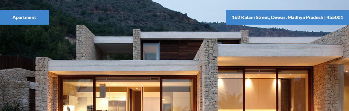
Output
Documents
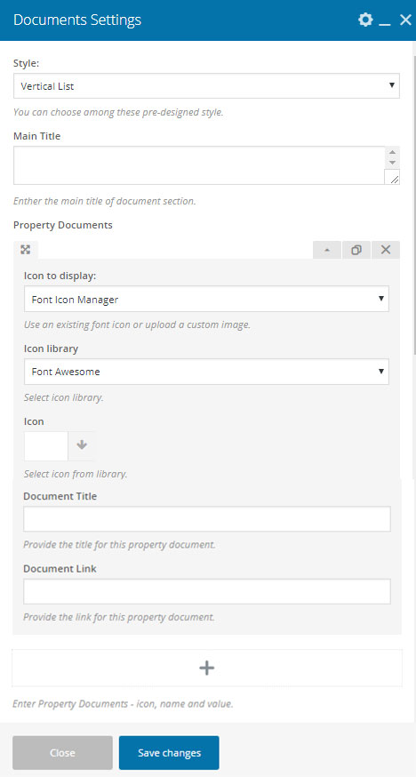
- Style : You can choose among these pre-designed style.
- Main Title : Enther the main title of document section.
- Property Documents : Enter Property Documents - icon, name and value.
- Icon to display : Use an existing font icon or upload a custom image.
- Icon library : Select icon library.
- Icon : Select icon from library.
- Document Title : Provide the title for this property document.
- Document Link : Provide the link for this property document.
- Save Changes
Output
Vertical List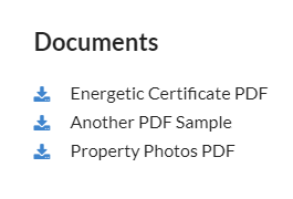
Horizontal List

Button
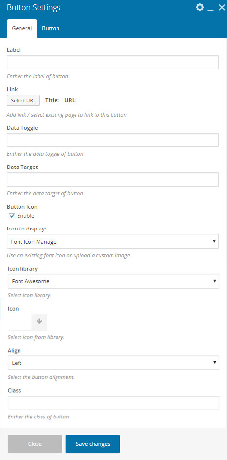

- Label : Enther the label of button.
- Link : Add link / select existing page to link to this button.
- Data Toggle : Enther the data toggle of button.
- Data Target : Enther the data target of button.
- Button Icon : Enable/Disable button icon.
- Icon to display : Use an existing font icon or upload a custom image.
- Icon library : Select icon library.
- Icon : Select icon from library.
- Align : Select the button alignment.
- Class : Enther the class of button.
- Button Text Color : Select button text color.
- Button Background Color : Select button background color.
- Button Icon Color : Select button icon color.
- Button Icon Background Color : Select button icon background color.
- Save Changes
Output

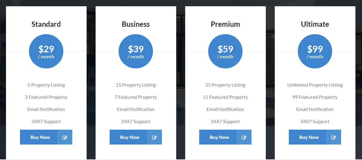
Package
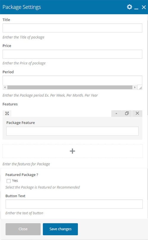
- Title : Enther the Title of package.
- Price : Enther the Price of package.
- Period : Enther the Package period Ex. Per Week, Per Month, Per Year
- Features : Enter the features for Package
- Package Feature : Enter the package feature.
- Featured Package ? : Select the Package is Featured or Recommended
- Button Text : Enther the text of button.
- Button URL : Button URL (http://example.com)
- Save Changes
Output
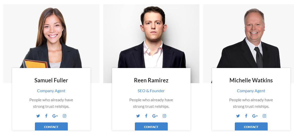
Our Team
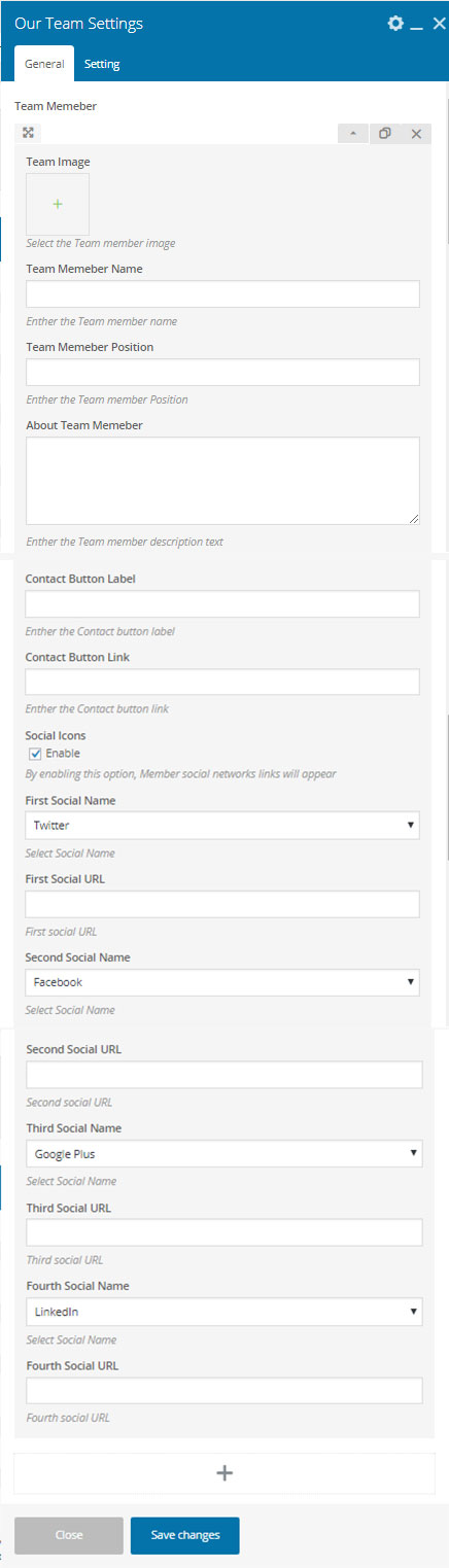
- Team Memeber : Enter Team Memeber - Name, Position, Detail and Social Network.
- Team Image : Select the Team member image.
- Team Memeber Name : Enther the Team member name.
- Team Memeber Position : Enther the Team member Position.
- About Team Memeber : Enther the Team member description text.
- Contact Button Label : Enther the Contact button label.
- Contact Button Link : Enther the Contact button link.
- Social Icons : By enabling this option, Member social networks links will appear.
- First Social Name : Select Social Name.
- First Social URL : First social URL.
- Second Social Name : Select Social Name.
- Second Social URL : Second social URL.
- Third Social Name : Select Social Name.
- Third Social URL : Third social URL.
- Fourth Social Name : Select Social Name.
- Fourth Social URL : Fourth social URL.
- Save Changes
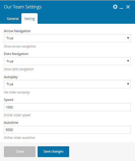
- Arrow Navigation : Show arrow navigation.
- Dots Navigation : Show dots navigation.
- Autoplay : Set slider autoplay.
- Speed : Enther slider speed.
- Autotime : Enther slider autotime.
- Save Changes
Output
Agent Detail
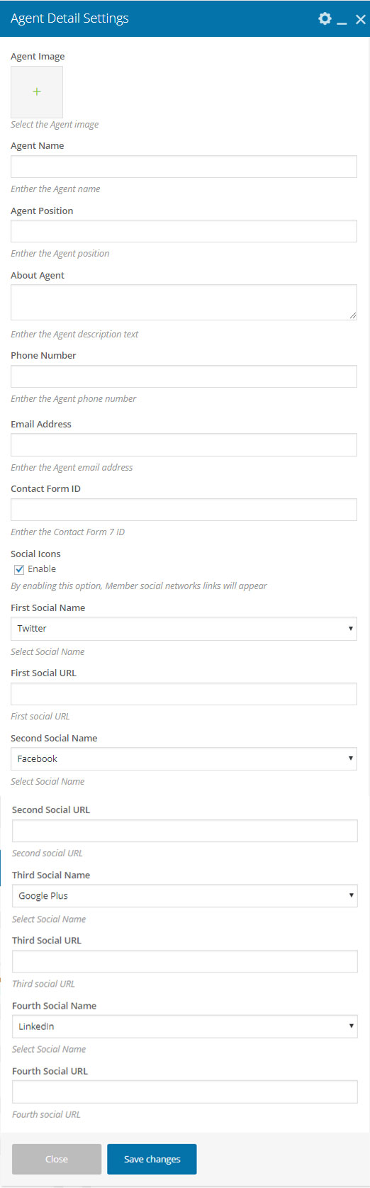
- Agent Image : Select the Agent image.
- Agent Name : Enther the Agent name.
- Agent Position : Enther the Agent position.
- About Agent : Enther the Agent description text.
- Phone Number : Enther the Agent phone number.
- Email Address : Enther the Agent email address.
- Contact Form ID : Enther the Contact Form 7 ID.
- Social Icons :
- First Social Name : Select Social Name.
- First Social URL : First social URL.
- Second Social Name : Select Social Name.
- Second Social URL : Second social URL.
- Third Social Name : Select Social Name.
- Third Social URL : Third social URL.
- Fourth Social Name : Select Social Name.
- Fourth Social URL : Fourth social URL.
- Save Changes
Output
Google Map
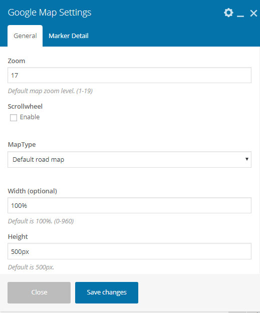
- Zoom : Default map zoom level. (1-19)
- Scrollwheel : Enable/Disable scrollwheel.
- MapType : Select map type.
- Width (optional) : Default is 100%. (0-960)
- Height : Default is 500px.
- Save Changes
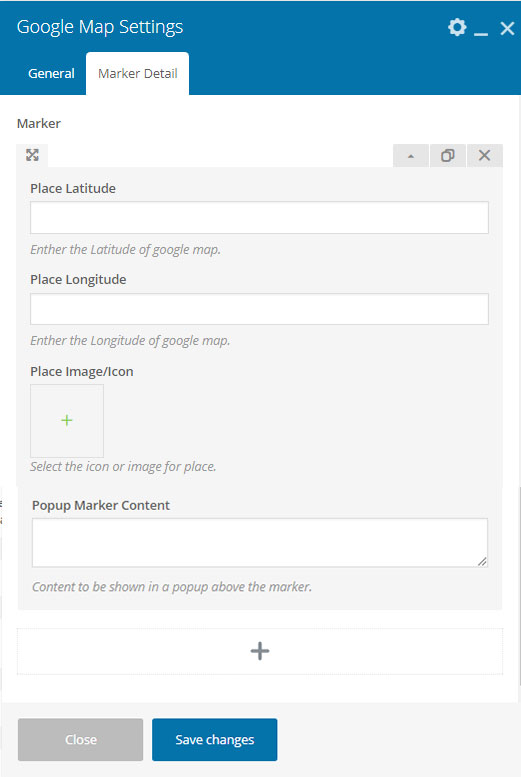
- Place Latitude : Enther the Latitude of google map.
- Place Longitude : Enther the Longitude of google map.
- Place Image/Icon : Select the icon or image for place.
- Popup Marker Content : Content to be shown in a popup above the marker.
- Save Changes
Output
Video Tour With Tab
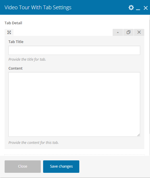
- Tab Title : Provide the title for tab.
- Content : Provide the content for this tab.
- Save Changes
Output

Icon Box

- Icon to display : Use an existing font icon or upload a custom image.
- Icon library : Select icon library.
- Icon : Select icon from library.
- Size of Icon : How big would you like it?
- Title : Provide the title for this icon box.
- Description : Provide the description for this icon box.
- Read More Label : Provide the read more link label for this icon box.
- Read More Link : Provide the read more link for this icon box.
- Save Changes
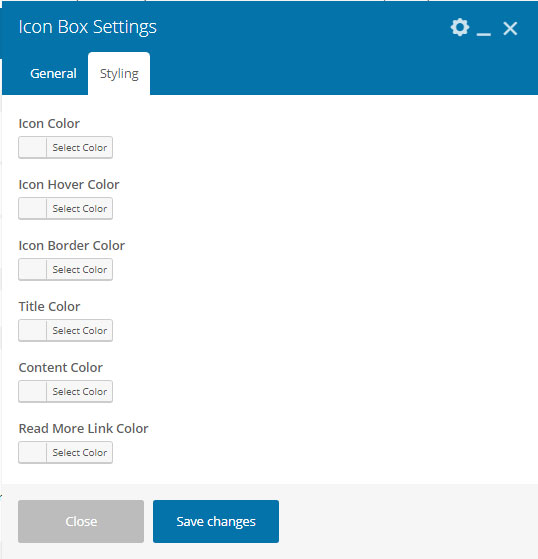
- Icon Color : Select the icon color.
- Icon Hover Color : Select the icon hover color.
- Icon Border Color : Select the icon border color.
- Title Color : Select the title color.
- Content Color : Select the content color.
- Read More Link Color : Select the read more link color.
- Save Changes
Output

PatelProperty FAQ
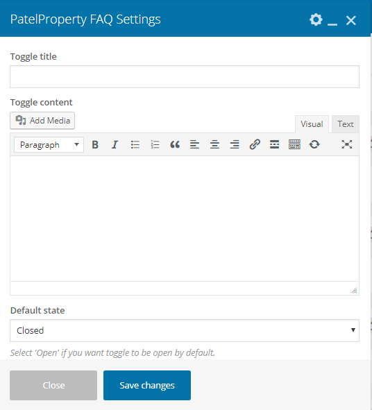
- Toggle title : Enther the toggle title.
- Toggle content : Enther the toggle content.
- Default state : Select 'Open' if you want toggle to be open by default.
- Save Changes
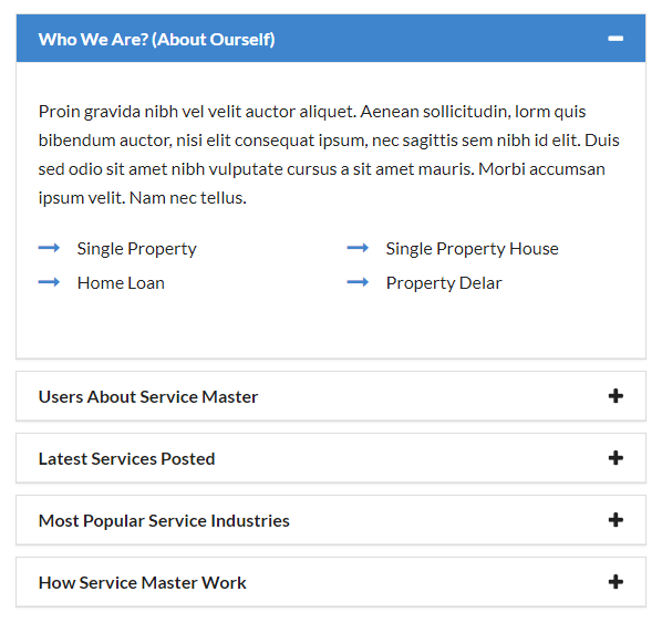
Output
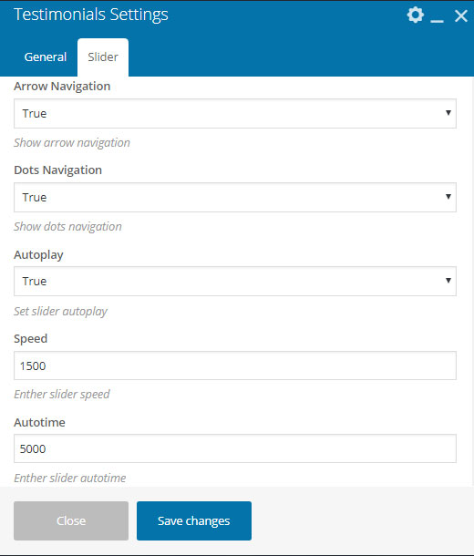
Testimonials
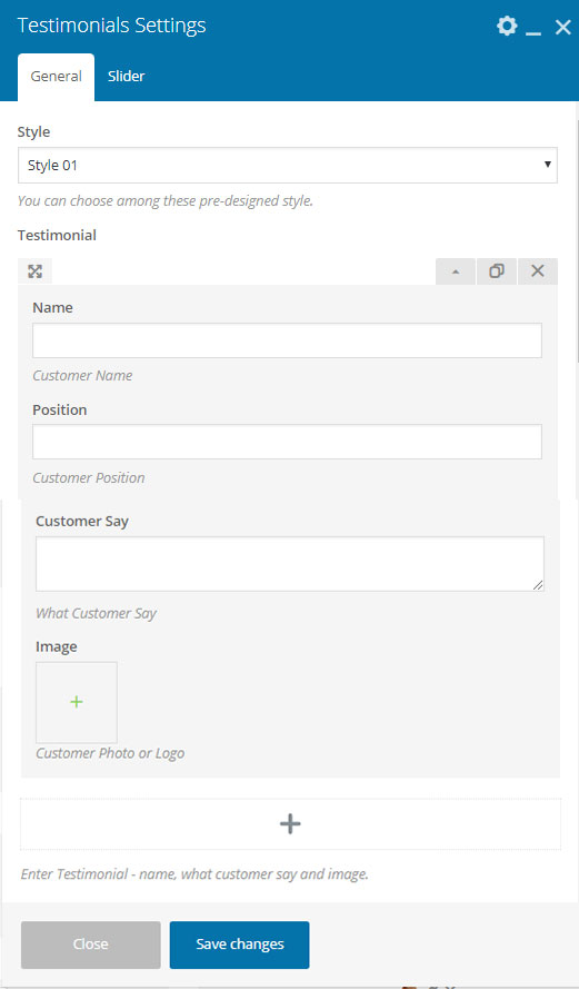
- Style : You can choose among these pre-designed style.
- Testimonial : Enter Testimonial - name, what customer say and image.
- Name : Customer Name.
- Position : Customer Position.
- Customer Say : What Customer Say.
- Image : Customer Photo or Logo.
- Save Changes
- Arrow Navigation : Show arrow navigation.
- Dots Navigation : Show dots navigation.
- Autoplay : Set slider autoplay.
- Speed : Enther slider speed.
- Autotime : Enther slider autotime.
- Save Changes
Output
Style 01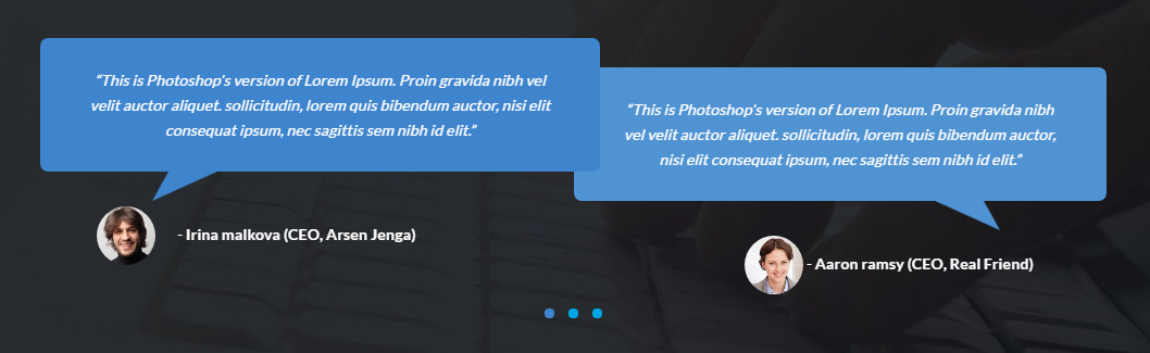

Interior/Exterior
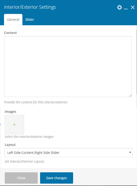

- Content : Provide the content for this interior/exterior.
- Images : Select the interior/exterior images.
- Layout : Set Interior/Exterior Layout..
- Save Changes
- Arrow Navigation : Show arrow navigation.
- Autoplay : Set slider autoplay.
- Speed : Enther slider speed.
- Autotime : Enther slider autotime.
- Save Changes
Output

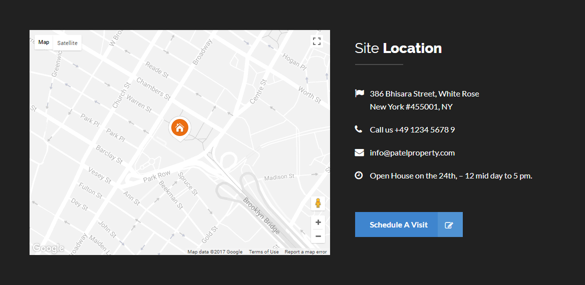
Site Location
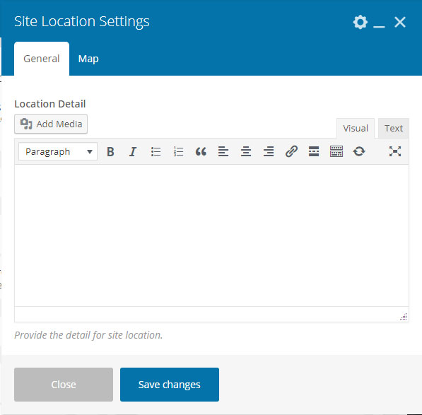
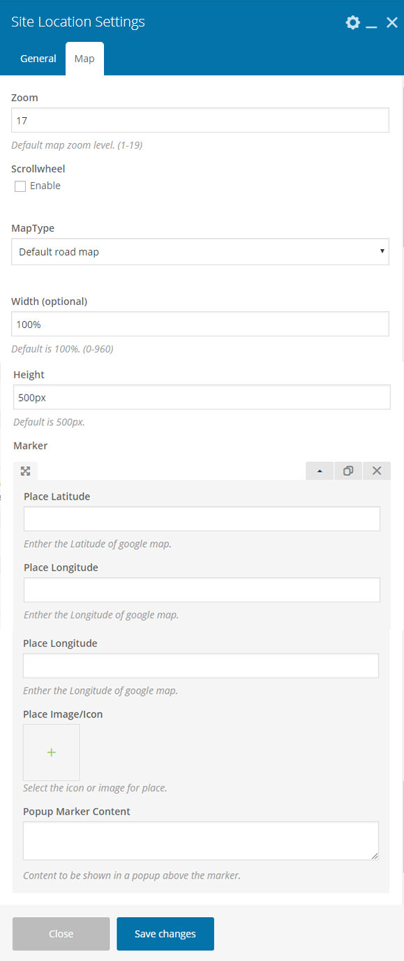
- Location Detail : Provide the detail for site location.
- Save Changes
- Zoom : Default map zoom level. (1-19)
- Scrollwheel : Enable/Disable Scrollwheel.
- MapType : Select map type.
- Width (optional) : Default is 100%. (0-960)
- Height : Default is 500px.
- Place Latitude : Enther the Latitude of google map.
- Place Longitude : Enther the Longitude of google map.
- Place Image/Icon : Select the icon or image for place.
- Popup Marker Content : Content to be shown in a popup above the marker.
- Save Changes
Output
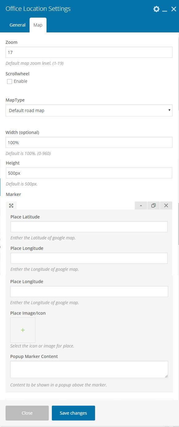
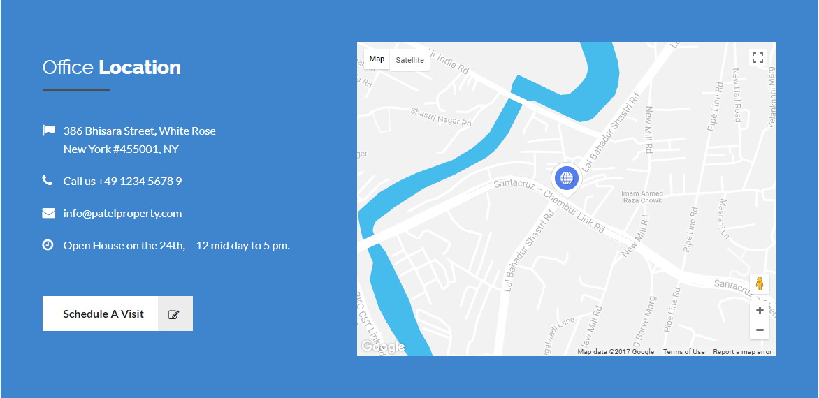
Office Location
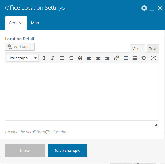
- Location Detail : Provide the detail for site location.
- Save Changes
- Zoom : Default map zoom level. (1-19)
- Scrollwheel : Enable/Disable Scrollwheel.
- MapType : Select map type.
- Width (optional) : Default is 100%. (0-960)
- Height : Default is 500px.
- Place Latitude : Enther the Latitude of google map.
- Place Longitude : Enther the Longitude of google map.
- Place Image/Icon : Select the icon or image for place.
- Popup Marker Content : Content to be shown in a popup above the marker.
- Save Changes
Output
Comming Soon
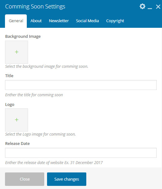
- Background Image : Select the background image for comming soon.
- Title : Enther the title for comming soon.
- Logo : Select the Logo image for comming soon.
- Release Date : Enther the release date of website Ex. 31 December 2017.
- Save Changes
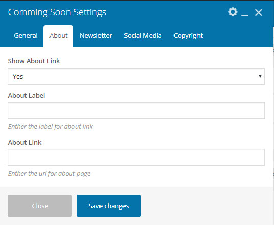
- Show About Link : Enable/Disable about link.
- About Label : Enther the label for about link.
- About Link : Enther the url for about page.
- Save Changes
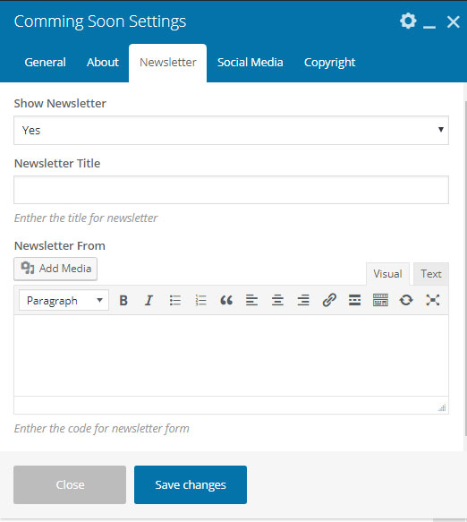
- Show About Link : Enable/Disable newsletter.
- Newsletter Title : Enther the title for newsletter.
- Newsletter From : Enther the code for newsletter form.
- Save Changes
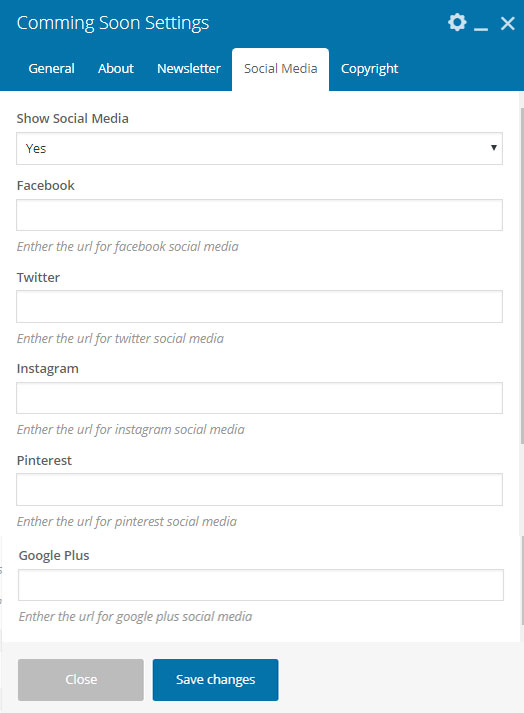
- Show Social Media : Enable/Disable social media.
- Facebook : Enther the url for facebook social media.
- Twitter : Enther the url for twitter social media.
- Instagram : Enther the url for instagram social media.
- Pinterest : Enther the url for pinterest social media.
- Google Plus : Enther the url for google plus social media.
- Save Changes
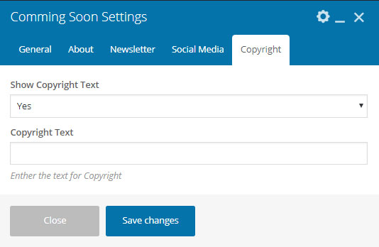
- Show Copyright Text : Enable/Disable copyright text.
- Copyright Text : Enther the text for Copyright.
- Save Changes
Output

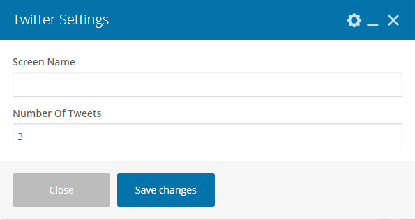
- Screen Name : Enther the screen name.
- Number Of Tweets : Enther the number of tweets to show from twitter.
- Save Changes
Output

6. Room Dimensions
Patel Property provide Room Dimensions for represent dimensions of room, kitchen, bathroom or bedroom etc.
Create a New Room Dimensions
You can add Room Dimensions in your site then see below step how to add Room Dimensions in Patel Property.
- Navigate to Room Dimensions > Add New
- To add a title of Room Dimensions.
- Enter the content of Room Dimensions and used Patel Property visual composer for your Room Dimensions detail more intrective.
- Once it's all done, make sure you click the Publish button

7. Gallery
Patel Property provide Gallery for Room, Nedroom, Kitchen or Bathroom etc.
Create a Gallery
You can add Gallery in your site then see below step how to add Gallery in Patel Property.
- Navigate to Gallery > Add New
- To add a title of Gallery.
- Select the feature image of Gallery.
- Once it's all done, make sure you click the Publish button

Gallery Category
- To add a title of Gallery Category.
- Select parent category of Gallery Category.
- To add a Description of Gallery Category.
- Once it's all done, make sure you click the Add Category button

8. Sidebars & Widgets
Patel Property Custom Widgets add content and features to your Sidebars. Examples there are Instagram, Custom Menu, Recent Posts and Video Tour more.
Sidebars
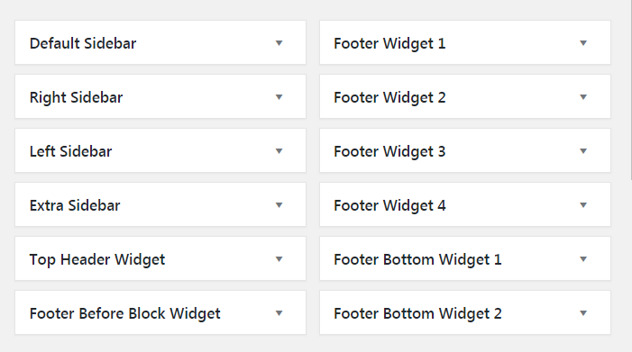
Page, Blog Or Post Sidebar
- Default Sidebar : For Page, Blog and Post Archives
- Right Sidebar : For Page, Blog and Post Archives
- Left Sidebar : For Page, Blog and Post Archives
- Extra Sidebar : For Page, Blog and Post Archives
Header Sidebar
- Top Header Widget : For Top Header
Footer Sidebar
- Footer Before Block Widget : For Footer Before Section
- Footer Widget 1 : For Footer column 1
- Footer Widget 2 : For Footer column 2
- Footer Widget 3 : For Footer column 3
- Footer Widget 4 : For Footer column 4
- Footer Bottom Widget 1 : For Footer Left Side
- Footer Bottom Widget 2 : For Footer Right Side
Widgets
Setting up Widgets
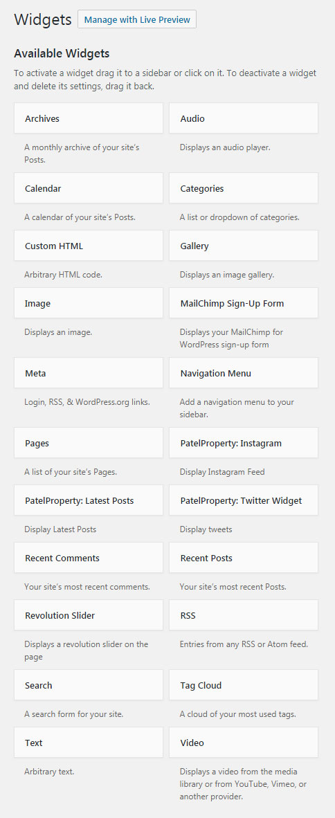
WordPress Widgets add content and features to your Sidebars and Footer. Examples are the default widgets that come with WordPress; for example post categories, tag clouds, navigation, search, etc. Widgets require no code experience or expertise. They can be added, removed, and rearranged on the WordPress Administration Appearance > Widgets panel.
WordPress Widgets add content and features to your Sidebars. Examples are the default widgets that come with WordPress; for post categories, tag clouds, navigation, search, etc. Plugins will often add their own widgets.
How to use widgets:
- Go to Appearance > Widgets.
- Choose a Widget and drag it to the sidebar where you wish it to appear. The widget areas designated
- Once you dropped the widget to widget areas, WordPress automatically updates the Theme and it will appear in its area.
- Preview the site. and look for the specified area you dropped your sidebar. for example if you used "archive widget area" you should look for it in archive loop.
- Return to the Widgets Panel to continue adding Widgets.
- To arrange the Widgets within the sidebar or Widget area, click and drag it into place.
- To customize the Widget features, click the down arrow in the upper right corner to expand the Widget's interface.
- To save the Widget's customization, click Save.
- To remove the Widget, click Remove or Delete.
Patel Property Widgets
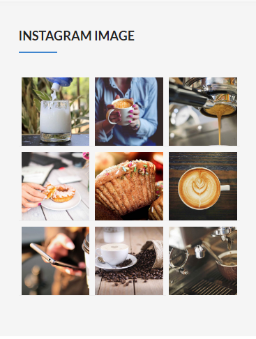
01. Patel Property: Instagram
Show Instagram Feed.
Input

- Title: Enther the widget title.
- User ID: Lookup User ID here
- Access Token: Lookup Access Token here
- Number Of Photo List: Enther the how many photo you list from instagram.
- Save Changes
Output
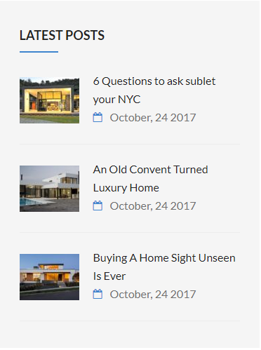
02. Patel Property: Latest Posts
Show the latest posts of blog into sidebar.
Input
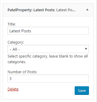
- Title: Enther the widget title.
- Category: Select specific category, leave blank to show all categories.
- Retina Big Logo: Upload your custom site retina big logo for one page template.
- Number of Posts: Enther the number of latest posts to show.
- Save Changes
Output
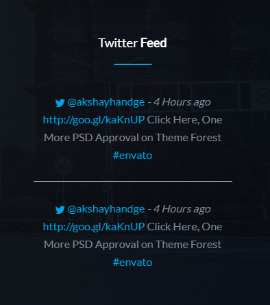
03. Patel Property: Twitter Widget
Show the tweets from twitter into sidebar.
Input
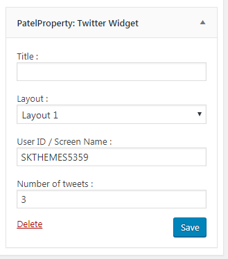
- Title: Enther the widget title.
- Layout: Select the Twitter layout.
- User ID / Screen Name : Enther the twitter user id or screen name.
- Number of tweets: Enther the how many tweets you list from twitter.
- Save Changes
Output
Layout 1
Layout 2
9. Customization
There are two ways to customize the theme without changing it's core files. First one is use the Custom Code section, second one is to install the Child Theme
1. Custom Code
To style the theme with custom CSS or JS code, navigate to Theme Options > Custom Code. Add your custom code in the code box.
2. Child Theme
A WordPress child theme is a theme that inherits the functionality of another theme, called the parent theme. Child themes allow you to modify, or add to the functionality of that parent theme. A child theme is the safest and easiest way to modify an existing theme, whether you want to make a few tiny changes or extensive changes. Instead of modifying the theme files directly, you can create a child theme and override within.
3. Customization Services
We can professionally customize your existing WordPress theme based on Ascned to fit all your needs. For this kind of service you can contact us here: https://sk-web-solutions.com/contact-us/ selecting "I Need Theme Customisation". Our team will be in touch with you to take care about everything of your project.
10. Increase Page Speed
- Download and install Autoptimize Plugin
- A) Please go to settings > autoptimize
- B) Make sure only "CSS Options" is checked.
- Download and install Optimus Plugin
- A) Go to Tools > Optimize all images and click on optimize all images button
- Download and install W3 Total Cache
- A) Go to performance > general settings
Once again, thank you so much for purchasing this theme. As we said at the beginning, We'd be glad to help you if you have any questions relating to this theme. No guarantees, but we'll do our best to assist.